
New designsystem
A new design system with components in Storybook.
For Riksbyggen, one of Sweden’s largest real estate developers
Project status
● Work in progress. More info coming soon!
About
Launch a new website with a design system in Figma and Storybook. WCAG compliant with 2025 regulations, new navigation, templates for different page types.
Scope
UX design, UI design, Headless CMS, Design system, component library, WCAG 2.1 lvl AA, Storybook, prototyping, user research, wireframing, workshops.
Role
UX Lead, product owner of design system.
Team
Product owner for the external website, Ux lead, developers, UI designer, project manager, requirement specialist.
About the client
Riksbyggen is one of Sweden’s largest real estate developers, specializing in the construction and management of housing, particularly for housing cooperatives. In addition to property development, Riksbyggen offers a range of services to housing cooperatives, including large-scale renovation projects, as well as technical and financial maintenance.
Delivery
145 + components in design system
270+ Variables
Documentation for components
Storybook Library for developers
📖 Have a look in Storybook
Project results
Estimated 87% increase in workflow efficiency for developers
Estimated page loading time improvement of
30–50%
Estimated 89% improvement of collaboration between designers & developers
A new design system + StoryBook
The client asked me, “Do we need a new design system? And do we need to connect it to StoryBook?” My immediate answer was yes!
This conclusion was partly based on the organizational setup they described. The company has over 3000 employees, with 100 employees in the digital department, covering IT, development, and communication. They also collaborate with consultants and agencies, and they don’t have their own design department.
Additionally, when reviewing their CSS statistics and examining their website, I observed that many components had inconsistent appearances. This inconsistency likely arises from various interpretations by developers, with much of the code being hard-coded. A detailed analysis of the website revealed 244 unique values for background colors and 905 declarations, which is quite substantial.
The brand color is red, and I identified 13 unique variations of this red across the website. Therefore, I strongly support the need for a new design system that connects to StoryBook.

16 identified variations of the brand color red
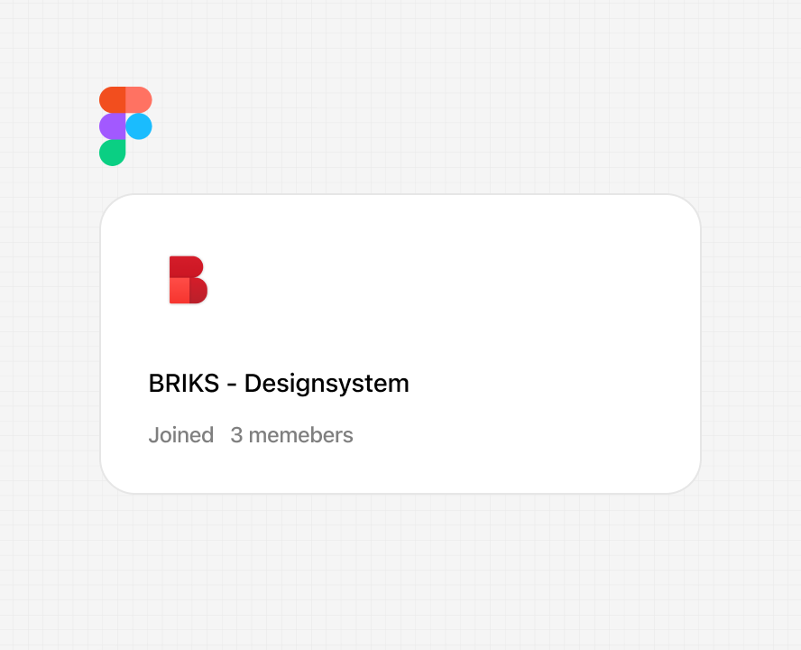
The name “BRIKS”
A play on “building bricks” that highlights the modular nature of design systems and reflects the company’s roots in construction, where bricks are a central element. The name also cleverly incorporates “RIKS”, referencing Riksbyggen and creating a meaningful connection to the company’s identity.

Process in short
-
More info coming soon
-
More info coming soon
-
More info coming soon
-
More info coming soon
-
More info coming soon
-
More info coming soon
-
More info coming soon
-
More info coming soon
Challenges in CSS structure
Riksbyggen.se had a large and complex CSS architecture, which resulted in:
Long page loading time
Maintenance is time consuming
Poor scalability- technical debt and struggles in workflow
Inconsistent design across the website.
Lack of components to create visual hierarchy
Accesibility challenges, both visual and in code structure.
Objectives
The ambition with the new design system and component library in StoryBook was to:
Improve collaboration between developers and designers
Reduce CSS complexity & technical debt
Create a more consistent appearance
Improve workflow, maintenance & scalability
Improve page load performance
Follow accessibilty requirements


Survey - In house
I created a survey to get an understanding of how many people in the organisation had knowledge about the current design system. Results came back very low. Only 25% were confident about where to find the design system. Showing that previous implementation lacked impact.


Designer workshop - Identify issues & component inventory
Bringing the whole design team together to identify issues on the website. Issues connected to usability heuristics, accessibility and component issues. Some issues detected were lack of contrasts, lack of hierarchy, a desktop first design with content in the right grid space. which were visually distracting. The brand color is red and its used across the website in interaction elements, such as buttons and links.


Component library MVP
Based on identified components and workshops with web editors, A MVP component library was created. Some new components were created to fill the business needs that had been identified previously. For example; card components got a clearer hierarchy and variations on the card component was created to fill business and communication needs.
Component workflow
Creating a flow chart with implementation process. Defining the roles and responsibilities.