

Customer service, Chatbot & Live chat
Working on improving the experience on our customer service pages for app & web
Working on a global level
Swedbank is one of Scandinavias biggest bank. But Swedbank is also a bank operating in the Baltics. My responsibility in this project has been to align all our channels and all improvements applied in our Swedish channels need to be applicable in our Baltic channels. In this project I have been working with our app, Internet bank, Swedbank.se and the Baltic app and Internetbank. In this team we had monthly users tests. The project has been divided in to sub-categories since its been quite a large task to tackle.

Chat - appearance, icon & placement
The purpose of this from a business perspective was to increase the usage of our chat function. From a UX-perspective we wanted to create a chat that was accessible, useful and easy to find.
We analysed the appearance of the chat in different channels and realised that the appearance was very inconsistent.
We also looked at the placement of the chat symbol and realised that it was different in all of our channels (swebank.se, the internet bank, app, and for the baltics)

For this project we
looked in to:
How to communicate that this is a chatbot
Entry point for app & web
Chat window, information and appearance
Communicate opening hours for live chat
Persona or not?
On-boarding message
Transparency or not?
Fallback and error?
Escalation process
Graphics & accessibility
Feedback

This picture is an example of how the entrypoint for the chat on Swedbank.se looks. 3 entrypoints for the same function.
Process
Survey
To get big reach we sent out a survey for our Swedish customers and another one for our Baltic customers. We wanted to find out what kind of naming and appearance of an icon would be best fitted for our chat service.
Our results came out very clear.
User test
Users got a few tasks, One of those was to find the chat. Preferability test on symbol.
Also a few contextual questions about when they would use the chat. If they had enough information before asking their question, for example opening hours and if they understood that they talked to a chat bot or if they expected it to be a live agent.
A/B test
We A/B tested the new symbol on 50% of our customers to see if the usage would increase. After 2 weeks we got the results that showed an increase of 41% usage.
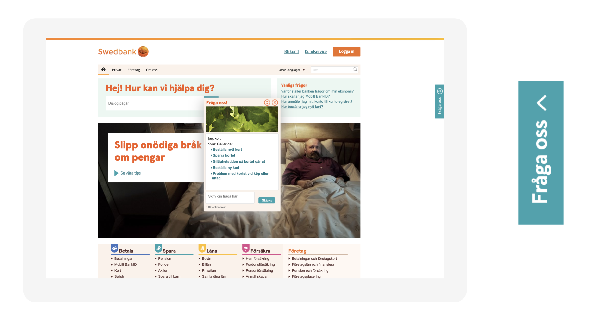
Before - Chat placement and Icon
Example of appearance at swedbank.se
The label “Fråga oss” was the previous appearance and placement of the chat.
Through benchmarking we realised that the placement was unusual and through user tests we realised that the naming didn’t communicate that this was a chat.
We needed to change the symbol to something that worked across all markets including the Baltics.
After - Chat placement and Icon
We did user tests to find out if it was clear and easy to find the chat in the old interface. Our insight was that the naming wasn’t clear enough and also that the placement was very hidden and hard to find.
Collaborating with the branding department to agree on naming, placement and colors for the new chat icon.
After testing this new placement results improved.
And the new symbol was easier to understand.

App - Icon placement
Placement and appearance for app. When a conversation is ongoing, the chat icon follows on all pages with a notification if user gets a new message.


Result:
41% increase of usage after 2 weeks
To summarise the project. we had to divide it in to different milestones. On of those milestones was the chat icon. In this project I wanted to showcase some parts of my process working on bringing this icon forward. Other parts that we have been working on are what is mentioned previously:
How to communicate that this is a chatbot, Entry point for app & web, Chat window, information and appearance, Communicate opening hours for live chat, Persona or not?, On-boarding message, Transparency or not?, Fallback and error?, Escalation process to live agent, Graphics & accessibility, Feedback widget and data collection.