

Replano - A digital maintenance tool for housing cooperatives
Replano is a digital tool that helps smaller housing associations efficiently plan and manage long-term technical maintenance. It enables board members to schedule, track, and budget for repairs and upgrades, offering a clear overview of maintenance needs, financial forecasts, and property condition. All in one centralized platform.
Project status
● Launched
Role
UX / UI designer
Scope
UX design, UI design, Prototyping, user research, wireframing, workshops.
Team
UX Designer,
Product Owner,
Project Manager, Technical Property Management Specialist,
Backend Developer,
Frontend Developer
Client
Riksbyggen
Delivery
Launch an MVP for digital maintenance planning with basic features.
Target audience: Housing cooperatives with a maximum of 50 apartments.
40 hours to complete a previously developed concept by an agency.
Base the structure on previous wireframes created by the agency.
Result and outcome
Client decided to transition all 2,000 users into the new interface.
➜ RESULT
From pilot scope to migration of 2000 clients
In this project, I helped turn an early version of the product into a solution that allowed Riksbyggen to expand beyond their initial pilot, which was originally limited to housing cooperatives with up to 50 apartments. By improving the design based on interviews and user testing, I was able to address key issues and add features that users wanted. As a result, Riksbyggen’s management decided to roll out the product to their whole customer base of 2000 users and make it the main digital tool for all their housing cooperative clients.
Through several UX and UI iterations, the product grew from a basic prototype—with one maintenance plan for all buildings—into a more flexible platform that could manage multiple buildings individually.

Key design decisions
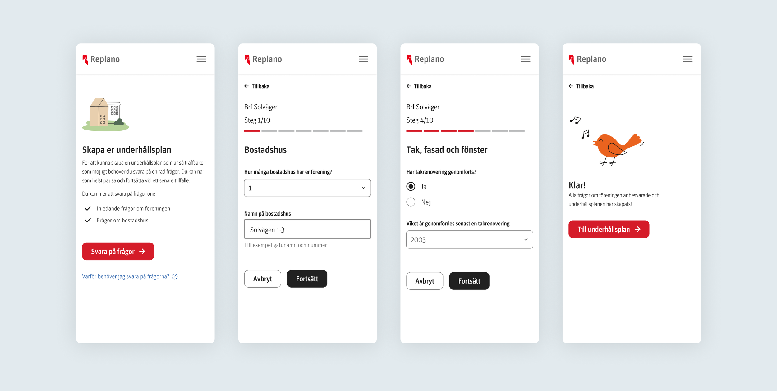
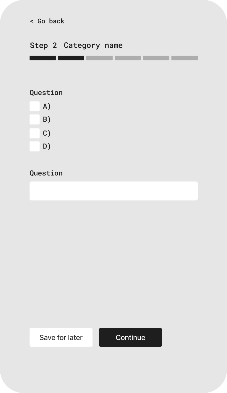
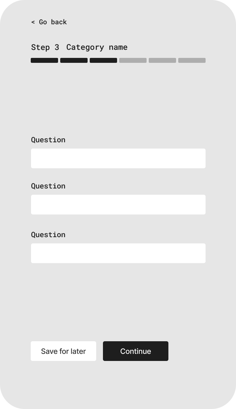
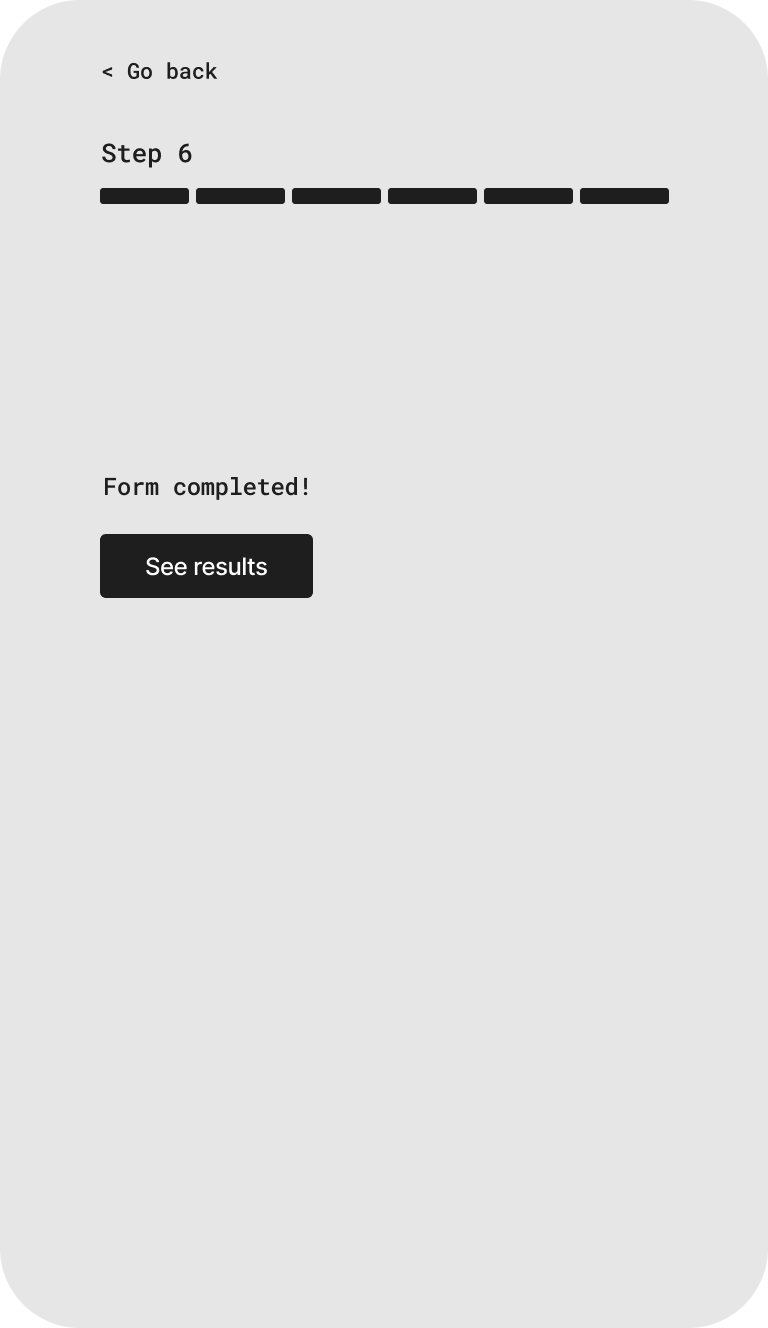
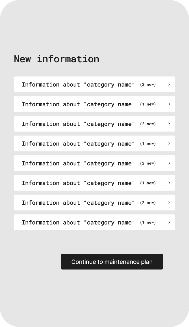
Reframed onboarding - From 1 page form to chapter based format.
Early testing showed that users found the original single-page form overwhelming and difficult to complete. A chapter-based flow with progress indicators and save/resume functionality provided better orientation and control. Adding our designsystem to contribute to consistency in all of Riksbyggens products.
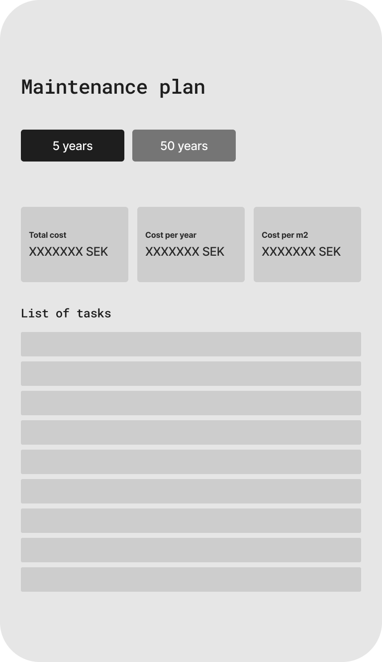
Maintenance plans for each building.
Interviews showed that most housing cooperatives consisted of several buildings, each with its own needs for maintenance. Another important finding was that they wanted to create their own custom structures, such as a laundry room or a separate building for recycling. The design was updated to allow separate maintenance plans for each building, with the option to copy or adjust the inputs as needed.
Aligned UI with new design system
The previous interface did not follow Riksbyggens design guidelines and the new design system. By reworking the interface using our design components, the updated UI improved clarity and responsiveness.

The foundation - design decisions and direction
Heuristic evaluation highlighted several UX risks in the form: poor error handling, complex terminology without support, and limited guidance.
Guerrilla testing - Preference test between two onboarding concepts: A single page form and a chapter based on-boarding flow with progress bar, showed a clear preference for the chaptered version.
8 moderated user tests with cooperative board members clarified the need for building-level separation. Provided feedback on information findability, and highlighted preferences for how maintenance plans should be presented—while also identifying unclear terminology.
The most important insights were that every building in a housing cooperative could be unique, and therefore needed individual maintenance plans.
Design iterations based on new insights were conducted through workshops with backend developers and the product owner to identify necessary changes to the data model. We also refined the structure of the user interface and iterated on the use of technical language to improve clarity for end users.
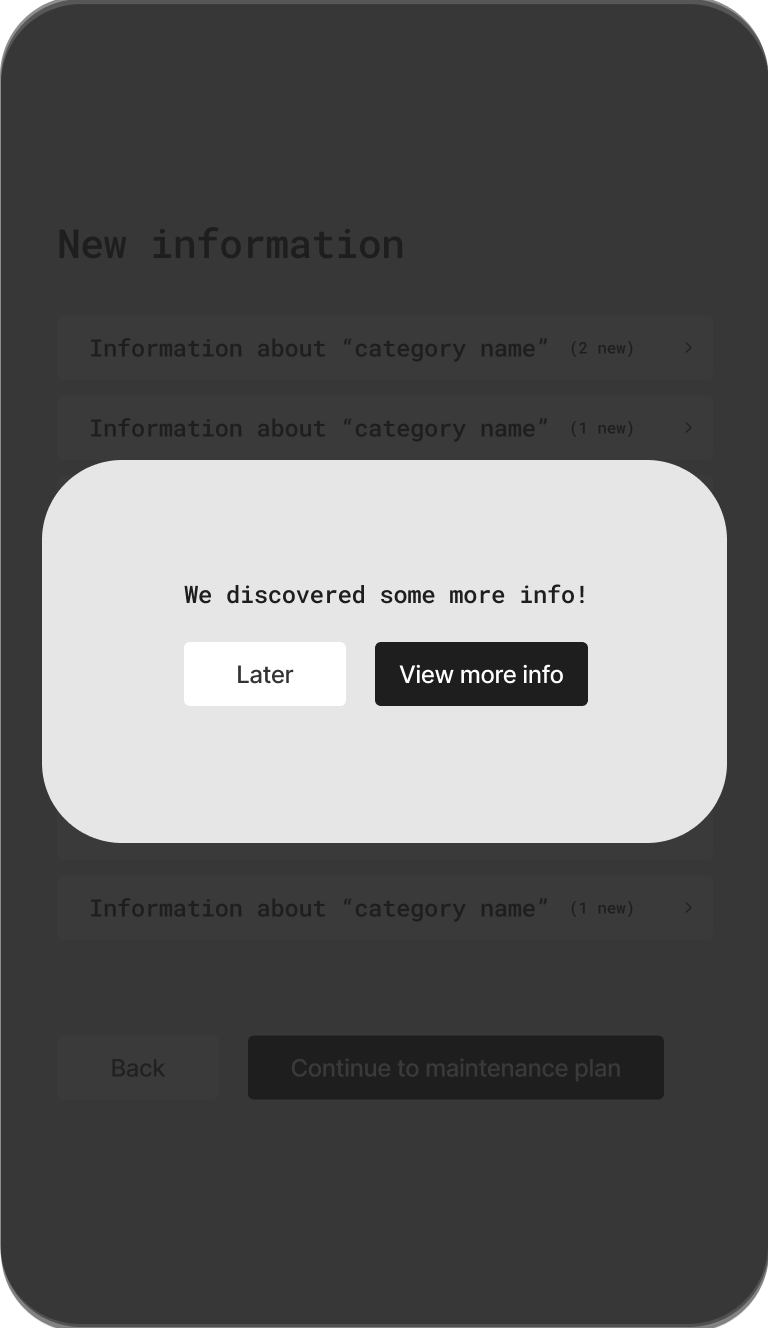
The final version included a modular onboarding flow, building-specific maintenance plans, and an overview page that allowed users to review and manage responses from previous forms. Users could easily add or remove buildings, and filtering options in the maintenance plan supported both high-level overviews and detailed task management."

Delivery v. 1.0


Process
-
How it began
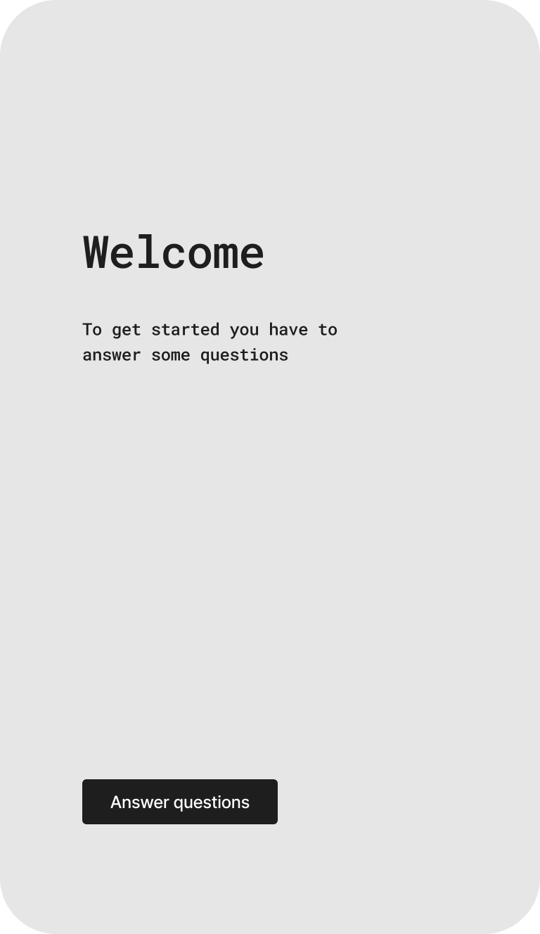
I took over the design created by an agency, which included a draft for an onboarding form, an interface for the maintenance plan, and an FAQ page. The initial design of the onboarding form featured components and icons not aligned with Riksbyggen's existing design system. Additionally, several UI elements lacked refinement.
Data points to create the maintenance plan
The form would be based on 12 data points to create an initial maintenance plan. Additionally, data from external sources would be collected. For example, information about the roof and facade area in square meters could be retrieved using satellite data. Since these external data points may take some time to load, they would be presented at the end of the form.
On-boarding form
The previous design I took over consisted of a long, single-page form. It did not align with the design system and lacked visual and functional refinement. To understand user preferences, I conducted a quick guerrilla test comparing a simple long form with a chapter-based version that included a progress bar. Participants clearly preferred the chapter-based approach, as it made it easier to track progress and allowed them to pause and return later. The long form felt overwhelming—especially on mobile, where it was harder to locate and correct input errors. In addition, several UI elements were poorly implemented and needed further refinement.Maintenance plan interface
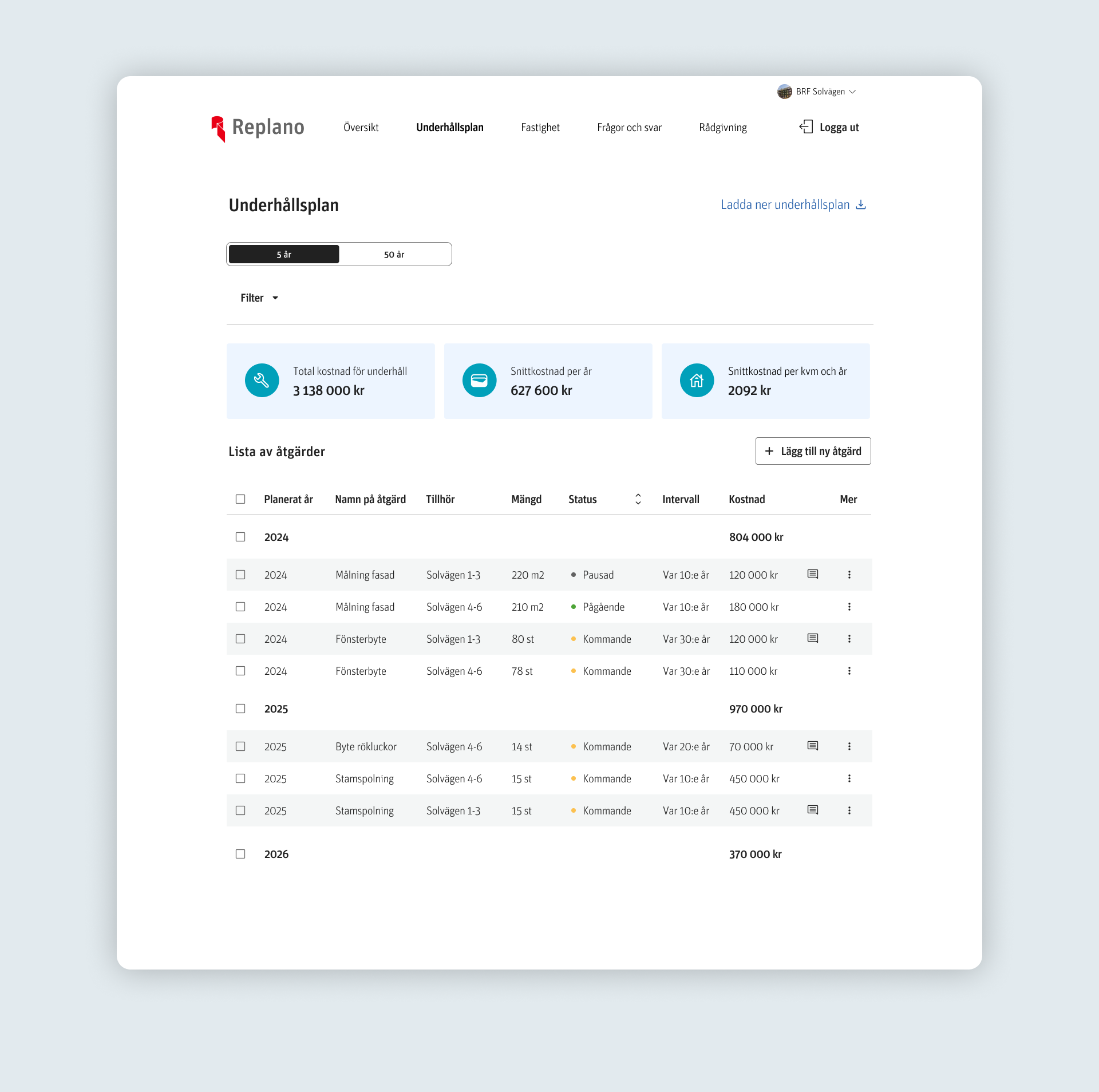
The maintenance plan came with specific requirements—for example, the ability to view estimated costs and planned maintenance over a 5- and 50-year horizon. Users also needed to be able to update the status of maintenance tasks and download or export the plan. The previous design relied on card-based layouts that took up a lot of space, making it difficult to get an overview—especially since the list could include over 200 tasks by default.
Previous answers and facts page
In the design I took over, there was no page dedicated to previously answered questions for the maintenance plan, and no place to find key facts about the housing cooperative—such as construction year and address. I created a page to present this information and included it in the test plan to see how, and if, it would be used.
FAQ page
Translated the FAQ in to design components without any major changes. -
It was important to identify the user of this product. The end user of the product would be non-experts in a tenant-owned association, doing this on their free-time on top of their regular occupation.
It could be a parent with small babies at home, a student, a nurse, a teacher, a lawyers, and rarely but occured: a professional on technical maintenance planning.
Because of this: it was very important that the product would support them in their context. For example through simple language, save and come back later functionality. clear feedback to create clear expectations, such as chapters for each catergory with a progress bar. Or tooltips with information on the difference between a Traction elevator and a Hydraulic elevator. -
Heuristic evaluation on the form
In order to evaluate the current form I did a heuristic evaluation resulting in a few points for improvement.
1. Errors would be frustrating to handle
Since this was a 1 page form with 12 questions that could result in follow up questions, errors could be very frustrating.2. Language would be complicated. Need for support
Technical maintenance is very complicated, and therefore the language could be hard, add help/support to design.
3. Save and continue later
To many of the questions, the answer was not something that the user would have top of mind. So in the context of the product, the user would need to save and come back later.4. Control, estimation and expectations
The layout of the form didn’t support the user in understanding the length of the form. -
To evaluate layout preferences, I conducted a quick guerrilla test comparing a simple long form with a chapter-based version that included a progress bar. The results were clear: participants strongly preferred the chapter-based layout.
Key insights:
The chapter-based layout felt shorter and easier to navigate.
Users appreciated the ability to track progress and found it helpful to know what was coming next.
Being able to pause and return later contributed to a more relaxed and manageable experience.
The long form caused frustration when errors occurred, especially on mobile, where it was harder to locate and correct them.
-
I recruited 8 participants with various level of knowledge about technical maintenance planning. It was important to get participants with an active role in a housing cooperative.
The test was divided in to 3 parts,
Interview
To get an understanding of their knowledge/experience level, their role and how they solved things today.
User test
The participants went through a prototype containing the on-boarding, the maintenance plan interface, an overview page with their responses. I was mainly interested in understanding what information they found important, what they couldnt understand, and if there was something missing that would be important for them when creating a technical maintenance plan. -
Insights were very clear and interesting, and required some bigger iterations on the data structure and interface. All participants seemed to have a housing cooperative containing of different buildings with different maintenance history.
Therefore, they requested the opportunity to make different maintenance plans for each building. They also wanted the opportunity to add their own “buildings” Or “constructions” such as a laundry room, or external recycling station.
These adjustments were important to implement before the first launch, because if they were implemented as an update; they would create a lot of friction for current users who would have to re-do their whole set up and break up their “all buildings in one maintenance plan” -
By the time we reached a 1.0 delivery: The design components for the new design system that was created parallell to this project was reviewed and approved.
I used the new design components to create the version 1.0
On boarding now contained a new structure, where questions that all buildings had in common was answered first. and then it was possible to “add building” And make a second on-boarding. with a possibility to copy the responses from previous buildings.
The maintenance plans were now on a level of individual buildings,
But there was of course an opportunity to look at a summary of the whole housing cooperative status & cost.
The maintenance plan got an updated filtering function making it possible to filter on buidlings and to move activites to another building.
The table component was inspired by the material design components design system. -
The product was launched, and the company aimed to introduce it to all existing customers. A total of 2,000 users were migrated to this new system. From the outset, the scope was to deploy this new product to smaller housing cooperatives with up to 50 apartments. Following the launch, the steering committee made the decision to broaden the product’s usage and migrate all customers to the new interface.
Wireframes On-boarding
Moderated user test and interviews
45 min user test with 8 participants with an active role in a housing cooperative. Moderated user test & Interview.


Insights from interview:
Expectations vs reality
Some key insights from the interviews and user testing were crucial in shaping the direction of the final product.
Participants wanted the ability to create separate maintenance plans for each building.
Buildings within a housing cooperative are rarely identical. Even in smaller cooperatives, buildings are often constructed in different years, maintained at different times, and vary in appearance. For example, facades and roofs are not always made from the same materials—an important factor to consider, as it can significantly affect maintenance costs and frequency of maintenance.
Adding their own buildings
Another important insight was the desire to add custom “maintenance objects,” such as an external recycling station or a shared wooden patio that requires yearly upkeep.


