
Digital Transformation of Personal Insurance
Designing a digital purchase and advisory journey for personal insurance.
Team: Product owner, business analysts, UX designer, legal counsil, backend developer, front end developer
Role: UX-designer, My role in this project is to lead and deliver on the UX design process.
I deliver low & high fidelity prototypes, flow charts, user journeys, conducting user tests, managing stakeholder relationships and requirements together with Business analyst.
Methods: Market research, qualitative research, interviews, surveys
Tools: Invision freehand, Sketch
Translating the current experience of advisory in to a digital space.
One of our goals was to create digital journeys for all our products. We wanted to help the customers gain confidence in doing things on their own through self service. We aimed to work “omni-channel” in order to make it easier for both advisors and customers to give and receive service & support if needed.
My responsibility was to shape the digital experience of our personal insurance products. Parallell to this I was shaping the holistic experience of related products which included focus on the insurance advisory journey.

Looking in to what we currently have on personal insurances and advisory. Finding a tool used by advisors called “Tryggakollen”. Collaborating with Business analysts to create a first draft of a flow. These are the “Bus stops” that we identified.

Collaborating with other competences in inVision Freehand. A way to discover and collect requirements from different stakeholders, understanding technical challenges and to identify new opportunities.

Creating a flow chart to ensure that all possible use-cases are covered. Used together with business analysts to discuss how we technically solve different situations.
Two kinds of user needs
We quickly discovered that there are two different kinds of user groups. One that is in need of advisory and support, preferring to put their trust in the bank to make decisions for them and give guidance on what products they need. The other user group are more self going and wants to get a price on a specific product (For example a life insurance). We needed to have this in mind when creating a structure for all the different insurances.

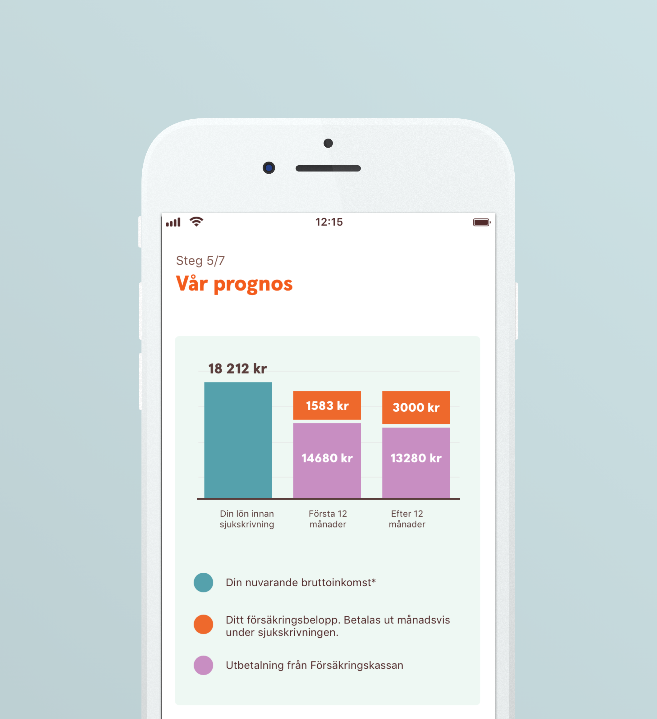
Before and after - Graph

Test participants struggled to understand the message in this graph. At the same time, this was a very important component on the page in order to understand the benefits of the offer.
After the redesign of the graph:
8/8 participants found the graph being the most helpful component on the page in order to understand the advice.